Looking for something specific?


Chocolate cake has a way of marking the moments that matter, from celebrations to quiet evenings at home. Making it from scratch brings a level of care and intention that is hard to replicate any other way. With the right ingredients and a thoughtful approach, you can create a cake that is every bit as rich, soft, and satisfying as any wheat-based cake. You don't have to sacrifice on flavor or texture, just because you are gluten-free.

Sugar Cream or Hoosier pie comes from the Midwest, and is often credited to the Shaker or Amish communities in Indiana. The oldest known recipe purports to be from 1816 - which is also, incidentally, the year Indiana became a state - but perhaps it was being made even before then.[source]
The pie is traditionally made with ingredients that would have been common in a farm pantry in the 19th century: milk or cream, sugar, and maybe eggs. The eggs are actually a very controversial ingredient; the traditional sugar cream pie is a very simple mix of cream, flour, and sugar which you mix up with your hands in the pie plate itself to avoid whipping the cream (hence another name, "Finger Pie"). The addition of eggs makes it into more of a custard pie - which is delicious, but a slightly different thing.
Because sugar cream pie is made from simple pantry ingredients, it is often grouped with what are now called “desperation pies.” These are pies that rely on staples like sugar, dairy, and eggs rather than seasonal ingredients such as fresh fruit. They became especially common in times and places where access to fresh produce was limited, whether due to season, geography, or economic constraint.[source]
The term itself is modern, but it reflects a very real pattern in traditional cooking: making something satisfying from what was readily available. In that context, "desperation pies" offered a way to create a dessert without relying on ingredients that were not always accessible.
Of course, today we have year-round access to fresh and frozen fruit, and good cream is often one of the more expensive ingredients in this recipe. Still, the idea behind the pie remains compelling. It is a reminder that simple ingredients, used well, can produce something rich, comforting, and enduring.
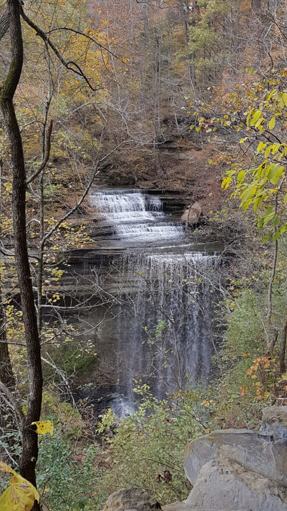
Clifty Falls State Park, Indiana
Waterfalls and pie, what's not to love?
Among the many names for sugar cream pie is the rather curious moniker "Hoosier Pie." The name points directly to its Indiana origins, where the dessert has long been a staple and a point of local pride.
But what, exactly, is a Hoosier?
Today, the answer is simple: a Hoosier is a resident of Indiana. The term has been in common use since at least the early 1800s and is now the official demonym for the state. Indiana residents have embraced it so fully that it appears everywhere, from university teams to everyday conversation.[source]
Where the word came from, however, is much less certain.
The first written instances of the word Hoosier crop up in the 1830's, and almost immediately after, people began asking the question of where the odd word had come from. They didn't know back then either, but some entertaining possibilities were suggested. One such possibility was that it came from the phrase "Who’s here?" shouted between cabins. Another was that it referred to the pugnacious nature of Indiana rivermen, who were so good at fighting and shutting up anyone who offended them that they became "Hushers" and then that term turned into Hoosier.
A slightly more serious etymological suggestion is that the word is related to the old English word "hoo" which meant "hill." In other words, that it started as a reference to "hill people" living in Appalachia, and then, as those people moved down into the Midwest, was applied to their descendants living in Indiana.[source]
In the end, no one knows for certain. What began as a mysterious nickname has become a badge of identity, and in the case of sugar cream pie, a reminder of the region where the dish took root.
Given its deep roots in the region, it is no surprise that sugar cream pie is widely considered the unofficial state pie of Indiana. While there was an effort in 2009 to formally recognize it, the bill ultimately did not pass.[source] Even so, the association has endured, and websites like visitindiana.com refers to it as the state’s "official unofficial" pie.
In practice, the distinction hardly matters. Sugar cream pie has been part of Indiana’s culinary identity for generations, long before any formal designation was proposed. It is a pie tied to place, to history, and to the habits of everyday kitchens.

From its roots as a pantry-based dessert to its place as a Midwestern classic, sugar cream pie reflects a way of cooking that values simplicity and resourcefulness. It does not rely on elaborate ingredients or complicated technique, but instead on doing a few things well.
That same idea carries through to the gluten-free version. With good ingredients and a careful approach, the result is just as rich, smooth, and satisfying as any traditional pie.

Now that the practical details are out of the way, let's step back for a moment to appreciate where this pie comes from. Pumpkin pie is more than just a reliable holiday dessert. It is part of a much older story, one that begins in early American kitchens and continues today, especially here in Illinois, where pumpkins are still grown in abundance.
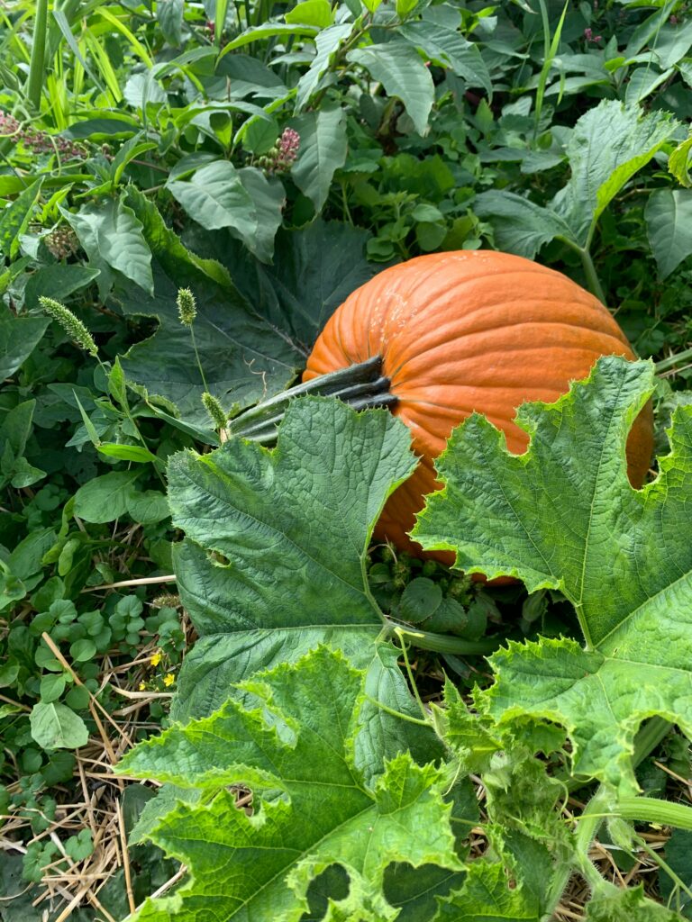
Pumpkin is a New World food and was not part of the European diet before the colonization of the Americas. Long before that, however, pumpkins and other squash were cultivated and used as staple foods by Indigenous peoples for thousands of years. They were valued for their productivity, storage life, and versatility, and were prepared in many different ways depending on the region and season. But they weren't baked into pies.[source]
Pies are a very Old World dish.[source] When English colonists arrived in North America, they quickly adopted pumpkin into their own cooking. And while the ingredient itself was entirely new to them, the idea of baking food in a pastry crust was deeply familiar. Pie, after all, was a well-established part of English food tradition. In this way, pumpkin pie became a true meeting of Old World and New World cooking, combining a native American crop with a European technique.
Even the name reflects this layered history. The word pumpkin comes from older word pumpion, which traces its roots back through French and ultimately to ancient Greek, where it simply meant "melon."[source] While pumpkins and melons seem quite different to us today, both belong to the broader family of gourds, and the colonists classified them accordingly.
By the 1600s, pumpkins had become a regular part of the New England diet. Being a native plant, they were easy to grow, and were used in soups, stews, and early forms of pie. These first pumpkin pies were not the smooth custard we know today. Instead, they were often made by layering sliced pumpkin with spices inside a crust.
Over time, the recipe evolved. By the late 1700s, cooks began stewing or roasting pumpkin and combining it with eggs, cream, sugar, and spices to create a smooth custard filling.[source] This version proved enduring, and it remains the foundation of pumpkin pie today.
While pumpkin pie began in the kitchens of New England, its center of gravity has shifted over time. Today, the heart of pumpkin production lies firmly in the Midwest, and especially here in Illinois. And in case it was not enough that pumpkin pie is delicious and a Thanksgiving staple, it is also the official state pie of Illinois. Since 2015, pumpkin pie has held that distinction, recognizing the important role pumpkins play in the state’s agriculture.[source]
Illinois produces roughly 85 percent of the pumpkin consumed in the United States, much of it grown in the rich farmland of central Illinois. These pumpkins become the fillings of countless pies each year, connecting local fields to tables across the country.
So if you are from Illinois, enjoying a slice of pumpkin pie is more than just a seasonal pleasure. It is a small way of participating in a tradition rooted in the land itself. Baking it yourself, especially with fresh pumpkin and whole-grain gluten-free flours, continues that tradition in your own kitchen. Click the button below to see the full recipe and instructions.

The origins of pie stretch back into the mists of time, but the modern pie has its roots solidly in medieval England. The word itself harkens back at least to the early 1300's, and referred to a pastry filled with various fillings - usually meat or savory, as fruit pies did not become common until a few hundred years later. Some people also speculate that the word "pie" could be related to "Magpie," since the fillings can be as varied as the bird's collections.[source] Pie was entirely about the fillings in the Middle Ages, with the crust being merely a vehicle to contain, cook, and then get those fillings to your mouth.
In fact, the crust - referred to as the pie's "coffin" back then - was designed for sturdiness over taste. There was no fat and no pie plate involved. The base was flour and water, with possibly some salt or sugar, and saffron for color (if someone was writing down a pie recipe back then, it was for a lord on a special occasion, hence the use of expensive ingredients).[source] The modern hot water crust is the direct descendent of these early pie crusts, which were not for eating. They were designed to contain and preserve the filling inside, while looking suitably impressive.
Fat - lard or butter - came into use in crusts from the 16th century on, so by the time the English colonists brought their beloved pies over to the New World, they were closer to what we would recognize as pie today. They still made stand-alone crusts, but the use of dishes or pie plates was prevalent by the first half of the 1800's. Mary Randolph, in The Virginia Housewife from 1824 mentions putting your "paste" (pie crust) in a "shallow dish or plate."[source] We also have an advertisement from a Raleigh, North Carolina newspaper in 1853 offering tin pie plates as part of a "house furnishing set," suggesting that a dedicated pie plate was already a familiar part of any household by the 1850's.[source]
From there, pie and its crust continued evolving through the 1800's and 1900's into the desserts and hearty pies we know and love today. The crust, which began as a simple vehicle for preserving and carrying food became one of the most beloved parts of the dish. A good modern pie crust still does the old work of holding and protecting the filling - but now we expect more from it. We want flavor. We want tenderness. We want something sturdy enough to support the pie, but good enough to deserve a bite all on its own.

For centuries, pie crust was asked to be useful first and delicious second. These days, we get to ask for both. A good pie crust should support the filling, add its own flavor and texture, and make the whole pie feel complete. That is exactly what this gluten free pie crust is meant to do - bring buttery richness, dependable structure, and that satisfying homemade quality that turns filling into pie. And once you have a crust like that, the only question left is what to fill it with.
Eight button examples showcasing some basic - but fun - animations. From a smooth hover effect, to icons, to the old school "realistic" keyboard button.
The Chicago Hardy Fig is usually listed as being hardy from zone 5 to 10. So as the name suggests, that means you should be able to grow it even as far north as Chicago.
But there is a caveat to the "hardiness" of Chicago Hardy Figs: the plant should survive the whole winter, but it will usually die back. Generally when a plant is labeled "hardy in zone 5" that means it will fully survive the winter. In the case of Chicago Hardy Figs, their branches are only hardy down to 10 degrees Fahrenheit. This means that the tree will die back to its roots every year - even in a "mild" Illinois winter - and have to re-grow. It is only the roots which are hardy down to -20 degrees Fahrenheit (i.e. zone 5 winters).[source]
The good news is that the tree should produce figs on the new growth. But regrowing every year is, of course, a setback. You may only get one crop of figs, instead of the usual two per year.
The bottom line is that to grow a healthy fig tree in zone five, you need to protect it during the winter.
There are a few different options to protect your tree during the winter. One of them is to grow the fig tree in a pot, and then bring it inside. Another is to plant it in the ground, and wrap it up with burlap or another insulating material. And a third is to "heel in" your tree.
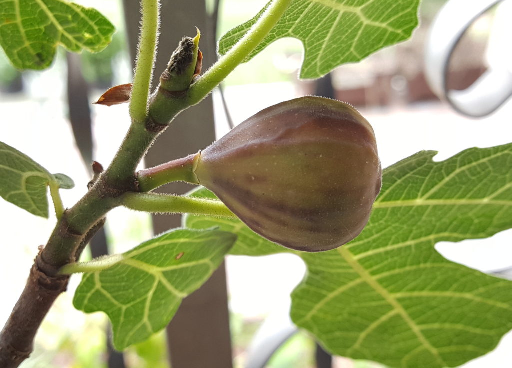
A delicious fig, the reward for fig tree care done right.
My first attempt to grow figs was in a pot, with the idea that I would bring the tree inside in the winter. This can be a very easy way to keep your fig safe over-winter, and care for your fig tree all year long. I have seen this method well for multiple years on end.
But there is a problem that comes with any potted plant that is kept outside in the summer, and brought in for the winter: bugs. The first year I brought my fig tree inside, it seemed to do really well. It survived the winter, and put on figs. But then the fruit began shriveling, and the tree started loosing its leaves. The cause? Mealybugs. I saved the tree (and you can read about it here), but pest problems remained a constant struggle.
The trouble is that pests, when they are outside, are naturally kept in check. But inside there is no cold weather or predators to keep them in check, and they can take over. So, if you are going to bring your fig tree inside, don't forget to treat it for bugs!
Fig trees are still trees, and as such, they will be happiest in the ground where their roots can stretch out. But remember, the hardiest of fig tree branches can still only take down to 10 degrees Fahrenheit. Even a mild zone five winter will have a cold night or two at or below that temperature. A cold winter will have multiple days below 0 degrees Fahrenheit.
So if you are going to try to keep your tree out all winter, they need a LOT of insulation. A sheltered southern-facing location would help. They will also need to be wrapped up in something insulating - such as burlap or bubble wrap, or both. Simply mounding leaves or mulch over their base will not be enough.
In the same vein as wrapping your tree, but even more protective, is "heeling in" the tree. Essentially, you dig a trench, and very carefully bend the tree over so that it is "laying down" in the trench. Then you cover it with mulch, sawdust, or the like.[source]
I have never been brave enough to try this method, but you can read about one person's experience with it here.
Winter care aside, figs are temperamental trees. Any discomfort is met with a giant temper tantrum.
And what does a tree temper tantrum look like? Why, dropping all its leaves, of course.
Is it too hot? The fig tree looses its leaves. Too cold? Drop those leaves. Too wet? Too dry? You guessed it... the leaves are falling.
But most of the time, when the fig's feelings are hurt, its a matter of water. Figs need a TON of water, which is a good argument for keeping them in the ground as opposed to a pot. If you do keep your fig in a pot, keep in mind that it will need to be watered every day in the summer. It may even need as much as a gallon or two of water a day once it gets big.
My first fig tree died a few years ago - I had to leave it overlong one winter, and that was too much stress for it. But that does not mean I have given up on figs! I have a new fig tree, in a large pot on my back patio. Come winter, I plan to wrap it up and put it in the garage for protection. I will update this post in the spring with my experience.
My family is gluten free for health reasons. And good news: this marshmallow frosting is entirely gluten free! No substitutions, no fuss, its just sugar, water, and egg whites by design.
Its also dairy free, which is what drew me to trying Italian meringue a few years ago. Before I discovered this pillowy delight, I always used buttercream on my cakes. But then I had to be dairy free for about six months for the sake of my baby daughter (milk protein intolerance; there were a lot of colicky nights). The combination of dairy and gluten free is pretty rough. But the good news is: this marshmallow frosting is naturally dairy free and gluten free!
Marshmallow frosting holds together nicely, and sticks to a cake. But it does not do well as a filling between layers. The weight of a cake easily pushes it out from between cake layers, leaving you with only a tiny coating. That is a significant disadvantage compared to buttercream.
There are a few ways to work around this.
One is simply to resign yourself to having a smaller cake. Maybe just two layers, with a light layer of filling in between each. Marshmallow frosting works fine for this.
Another is to provide another sort of structure to keep your layers separate. I have used fruit - specifically blackberries - secured with toothpicks for this purpose in the past, and it has turned out great. Basically, you arrange your fruit in between each layer, and spear a toothpick through the fruit and cake layers in a few key places. Fill in between pieces of fruit with your frosting. Enjoy the amazing combination of fruit, cake, and marshmallow!
Between the banana and the milk, there is decent volume of wet ingredients in this batter. You want to make sure it does not get too wet. The batter should be stiff when you put it into your chosen baking pan. If it is even a little bit "soupy," you may end up with a raw-tasting bread.
Speaking of chosen baking pan, I have tested this recipe both as a "coffee cake" baked in a casserole dish or a pie plate, and as a "bread" baked in a cast iron bread pan. I do recommend the cast iron bread pan - both because of the aesthetics, and because the cast iron helps it cook all the way through faster. But either approach will work.
Once the bread is in the oven, it needs ever minute of its cook time in order to be completely done. And even when it looks done - maybe give it 5 more minutes. Also, please note: the crumble topping can "disguise" the toothpick test by coating the toothpick in butter so that it emerges clean when it really is not done in the center.
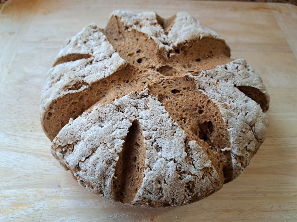
A crusty loaf of gluten free sourdough bread - the reward for keeping gluten free sourdough starter
For years, I thought that sourdough bread was out of reach on a gluten free diet. That classic recipe of just flour, water, and salt to make bread requires wheat flour, after all. Will the wild yeasts still come to give the bread rise if the bread is made of gluten free flour? Can you ferment gluten free dough when it has so many extra ingredients, like flaxseed and psyllium husk, and eggs? Surely such deliciousness as sourdough is out of reach if you cannot have wheat...
Not true. Sourdough starter can be made from many different types of flour, including gluten free ones, such as brown rice flour, sorghum, and buckwheat. Yes, you can have gluten free sourdough! You just have to make your own gluten free sourdough starter.
In order to make anything sourdough, you need sourdough starter. The starter is a flour, water, and yeast mixture, that you can then add to almost any baked good. It adds a sour tang to your breads, pancakes, or biscuits. Additionally, the yeast in the sourdough makes the nutrients in the flour more digestible, making fermented sourdough baked goods more nutritious.
Making the starter is easy - put an equal amount of flour and water in a jar on your countertop, out of direct light. Every day, discard half of the starter, and replace it with equal parts flour and water. After a few days, the starter should start bubbling. After a week, it is ready to use.
As long as you have your starter, you need to keep feeding it. That means adding equal parts flour and water every day. The more starter you have, the faster it will eat through that new flour, and so the more flour you will need to add to keep it happy. The solution to the ever increasing appetite of sourdough starter is to use it, or discard it. More on that below.
You can use any gluten free flour you like in your sourdough starter, though wholemeal ones will probably work the best. I personally use brown rice flour, and sorghum. I have also used just brown rice flour, and it worked quite well. Millet flour and buckwheat are also good options.
What happens if you don't feed your starter?
Terrible, awful things.
Forgetting to feed your starter for one day is not a big deal. The water will separate from the flour, and it will bubble sullenly at you. Just stir it, and feed it again, and the starter will be fine.
But if you leave it for multiple days, you put your sourdough starter at danger for mold growth. When the starter is healthy and well fed, the "good" yeasts in the starter are able to keep the bad bacteria at bay. When they are hungry and weak, harmful bacteria can multiply, and leave you with an inedible sludge. Sourdough starter gets stronger with age, so you may have more room for error if you have an older starter.
What mold or other nastiness you get will depend upon your environment. For me, I had two starters ruined by a pink "mold" that smelled vaguely like bad cheese. The first time, my starter was a few months old, and I had no backup in the fridge. I had to throw the whole thing out. The wisdom of the internet suggested that what I encountered was serratia marcescens, a pink-colored bacteria which loves moisture, and can cause various infections in humans. Some people say that they have salvaged starters from serratia marcescens, but given that this bacteria is one that often haunts the dark corners of bathrooms, I opted to start over. Best to be safe.
Once your starter is old enough to use - so at least a week old - then you can put it in the fridge. This will slow down its growth, meaning that you only have to feed it once a week. This keeps it from going bad just because life got in the way of feeding it for a few days.
Now I do not keep my starter in the fridge, despite my previous mishaps. The reason is that I want it to grow and mature as fast as possible to fuel my baking. An older starter makes more delicious baked goods.
But I do keep all the sourdough discard in the fridge. This lets me dip into it whenever I have extra baking to do, and as long as I use the discard in a week, it is on hand as a "backup starter" should my primary starter suffer a mishap. That extra bowl of discard saved me from starting again from scratch on my second run-in with serratia marcescens.
If you need to be gone for an extended period of time, sourdough starter will be fine in the refrigerator for a week or so. I have left it as long as two weeks in the fridge with no harm done. But after a couple of weeks, it will need to be fed.
For even longer periods of time, you can store some starter in the freezer. It will keep there safe and sound for about a year.
In both cases, you will need to give the starter some time to "wake up" once you take it out of its place of cool storage.
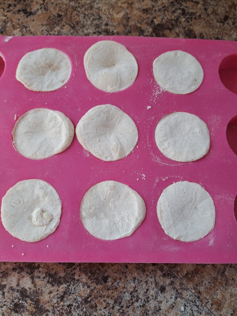
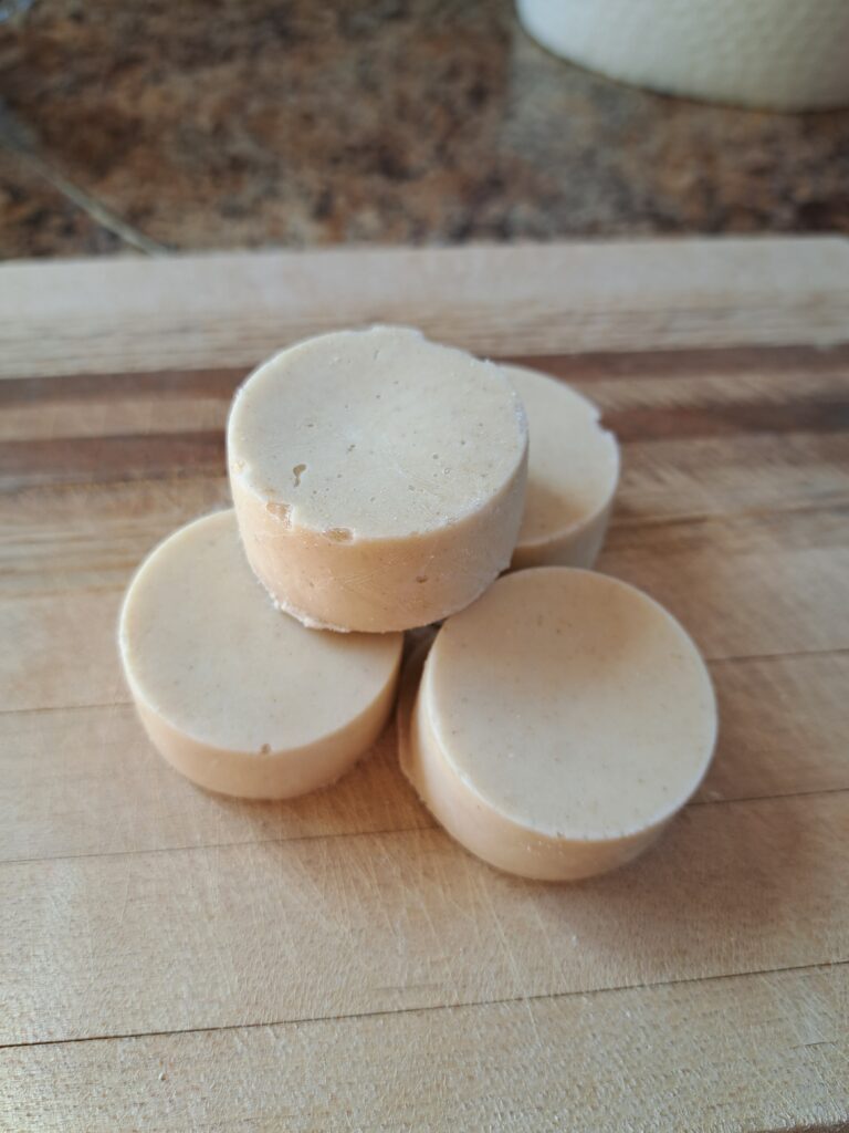
Put your sourdough starter in a silicon mold to create little sourdough disks and freeze for later!
Also called a Dutch Baby, the German pancake is neither German, nor is it Dutch. It was developed in the USA in the early 1900's, at a restaurant in Seattle Washington. Though the source has long been archived, you can still read about that restaurant and the creation of the "Dutch Baby" here.
Some people say the German Pancake was inspired by the German Pfannkuchen, and perhaps it was. But it bears a much larger resemblance to a popover, or sweet Yorkshire Pudding.
Like many gluten free recipes, the behavior of this pancake depends on the flour you use. I would say it is more finnicky than most about what will and will not create the perfect fluffy pancake. You can use any cup for cup gluten free flour, but certain mixes cause a denser and thicker pancake. I have tried it with rice flour, flaxseed, various cup for cup gluten free flour mixes including Bob's Red Mill, and also Namaste Perfect Flour blend.
Rice flour by itself does not hold together properly. It needs something to help the eggs bind.
Rice flour with flaxseed as a binding agent separates for some reason. The result is much closer to an egg dish than a pancake dish.
Most cup for cup gluten free flours with xanthum gum work as expected. But Namaste Perfect Flour Blend - which is one of my goto flour blends - gives a very dense thick pancake. This is quite nice in its own way, but it isn't really the German Pancake experience.
I recommend using Bob's Red Mill All Purpose Flour, along with a little psyllium husk. It has no xanthum gum, but still holds together wonderfully. It should give you the proper fluffy rise, and crunchy crust.
The key to butter syrup is the amount of time the butter-sugar-milk mixture gets to bubble away on the stove. About 7 minutes is perfect. Less than that, and the syrup will be a little too thin. Don't get me wrong - it will be delicious no matter what, but it will not fully come together until its had its 7 minutes of simmering.
If you let it bubble too long, I suppose it could get too thick. I have not ever been in danger of making this mistake - I'm always in a hurry to finish the syrup and get on to eating breakfast!
This recipe makes about a cup of syrup, which is more than adequate for 2-3 people. If you have more than 4 people who will be partaking, then double the recipe, just to be sure.
That ~1 cup of liquid will bubble up while it is cooking. As in, it will at least double in size when you add the baking soda. So make sure your pan is large enough to accommodate that sudden increase in volume!
The syrup does settle back down as it cools, however, so you do not need to worry about the serving pitcher. Anything that can hold 1-2 cups of liquid will be adequate.
Eight simple CSS button styling examples. Straightforward design - no animations, no fading.
